Editor’s note: This is the fourth in a series of four reports with highlights from the Hydraulic Fracturing Test Site in the Permian Basin. Click on links for the first, second, and third parts.
Drilling a well to collect hundreds of feet of fractured core for fracturing research was a big bet. It is one of most expensive ways to study a reservoir, and the research partnership drilling it at the Hydraulic Fracturing Test Site was going to use it only to produce science.
To improve the odds that the bet would pay off with a valuable sample of fractured rock, the private-public research partnership tried a new method for displaying microseismic data to highlight where fracturing activity is most intense.
“It is hard to get answers from microseismic data,” said Iris Wang, geophysical advisor for Laredo Petroleum, during a presentation about this approach at the recent Unconventional Resources Technology Conference (URTeC 2937228).
During the presentation, she showed fractured animations that look quite different from the familiar microseismic displays showing brightly colored pointillist clouds representing the sounds of shearing, rock faces shifting across each other as pressure pumping stresses the formation.
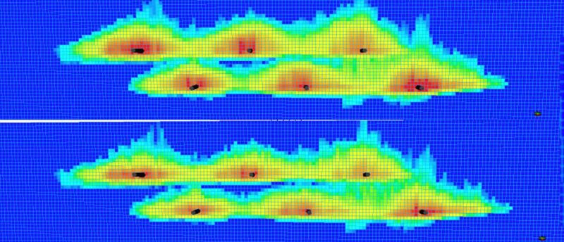
Researchers analyzed the data and displayed it as a heat map, using colors ranging from dark red for the most intense areas to light red for the least. While this 2D graphic display format has been around for decades, it is only recently been used to turn complex reservoir data and modeling into a simple, intuitive image.
A recent paper by Schlumberger and Laredo discussed later uses of heat maps to display and compare simulations of unconventional development and completion variables.
Underlying Laredo’s heat maps is analysis that pushed the limits of what conclusions can be drawn from the sounds of these micro-earthquakes that are used for microseismic. They are an indication of stress on the rock at any location, but it is hard to locate where they originate and the enormous number of events recorded do not include the sound of productive fractures growing. There are places where fracturing sets off shearing events, but does not open up much productive rock.
The displays require converting microseismic data into a form that offers a reasonable approximation of where fracturing activity is most intense. The method was described in a previous paper URTeC 2674376, and the current papers reports on an alternative method developed since.
Creating images of the “pseudo stimulated rock fabric” required finding a statistically valid way to locate the origin of the recorded events whose 3D coordinates come with a difficult to define level of uncertainty. This required doing a “kernel density estimation” as a way to “estimate the probability density function of a random variable.” Wang described it as “sequencing of populations of events”
The heat maps approximate where activity is most intense at any time. Short animations were created using images, each about 10 minutes apart. They show how fractures grow and fade, some much larger than others.
Often they show stages curving back toward the next stage or expanding off to another well. “Microseismic events migrate toward the heel for the rest of the events which we think is a result of stress shadowing,” Wang said, adding, “When you pressure up the toe you go to the heel.”
Mapping Proppant Intensity
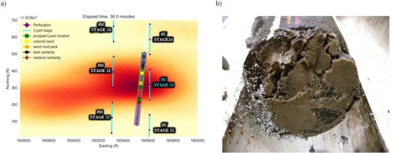
Heat map imaging was a factor when Laredo chose the path for the slanted well used to gather about 600 ft of core. “We were able to use microseismic to give us the best hope of encountering the fracture network,” said Joe Wicker, team lead for analytics at Laredo. He delivered a paper at the conference on how the heat maps and other information can be used to evaluate fracture efficiency (URTeC 2937221).
The paper said that changes in the microseismic signature were correlated with changes in pumping rates and pressures. And the event density was a reliable indicator of fracturing density. It did acknowledge there are limits to what microseismic can measure, but “this study provides ground truth examples and insights into the degree of accuracy microseismic can offer as a technology in discerning the effectiveness of modern completions.”
The papers were greeted by a skeptical questioner who said their method linking the sounds of shearing with fracture intensity ran counter to the conclusions of technical papers delivered in the past. Another asked if Laredo had used what it has learned to change its injection clusters. Wang responded, “We have done some analysis from cluster spacing but we do not have time to cover it in this talk.”
Heat Maps Everywhere
When Schlumberger and Laredo took on the daunting task of creating a workflow to mash up multiple geologic models and microseismic to evaluate what fracturing methods are likely to work best, they had a problem.
“We understood we needed something that simplified the end result,” said Piyush Pankaj, a principal reservoir engineer and team lead for Schlumberger. During a presentation at the SPE Annual Technical Conference and Exhibition, he summarized the multiple inputs used to build a numerical reservoir simulator that evaluated eight important unconventional development and completion options (SPE 191442).
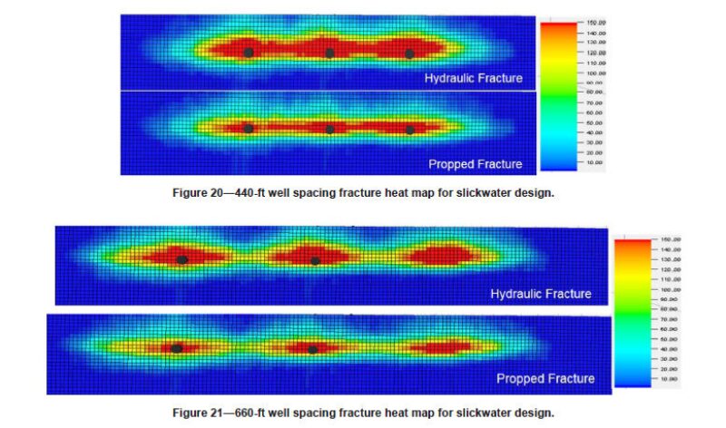
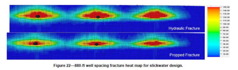
“These heat maps were used to convert unconventional fracture modeling geometries into a representative fracture footprint to evaluate completion type and well spacing, and to correlate with field observations, such as microseismic and well interference tests,” the paper said.
While that paper and presentation never mentioned the test site work, both the paper and test site development date back to 2015 and deal with similar basic questions.
Well spacing was investigated in the paper. Heat maps were used to compare the likely area fractured with wells spaced at three intervals: 440 ft, 660 ft, and 880 ft. The heat map displays showed the middle spacing fractured most of the rock, without the overlapping seen at 440 ft, or the gaps between wells at wider spacing. Coincidentally, the wells on the Fracturing Test Site pad were 660 ft apart.
Some of what researchers found is not surprising. Pumping more water and more proppant, for example, yields significantly greater production. But one finding that differed from the norm suggests getting away from slickwater, which is 99% water. The study found that a hybrid mix of 80% slickwater and 20% fluid with viscous linear gel carries more proppant using 50% less fluid than slickwater alone. And the hybrid mix could “greatly reduce” the complexity and area fractured as well.
Researchers also found that tighter spacing of fracturing clusters more effectively treated the area near the wellbore—which was confirmed at the test site using tracers—and fewer clusters per stage is more effective. The best cluster design it found was two closely spaced clusters per stage. That would require a well with 93 stages, which would be time consuming and costly.
The paper addressed all cost questions by saying that “the economics of different completion design sensitivities are beyond the scope of this paper.”