
In the first edition of The Way Ahead, Dusterhoft and Giddens wrote about one of the fundamentals of being a technical professional: how to write a technical paper. In this edition, John Thorogood details the technical journals that such papers appear in and why papers are so fundamental to the industry and to technical personnel in the industry. This article covers the next step—how to present a paper. This article covers hints and tips for presenting papers at SPE conferences and workshops, but the material also applies to other situations, be they internal to your organization or a public forum.
Presentation Skills
Presentation skills are taken extremely seriously by organizations and considered a major skill in every sector of the industry, not just for technical staff. Before discussing some of the hints and tips, let us first examine why presenting is seen as so important for all staff and, in particular, technical personnel.
When I first started to think about this article, I immediately felt that technical presentations are more difficult than other presentations. However, after some reflection, I realized that giving a technical presentation is no more difficult than giving any other presentation. However, what is different is the necessary preparation time and effort, and this really comes down to the complexity of the message in technical presentations and the diversity of the audience. If we trace the elements of both complexity and audience, we come to the conclusion that the root cause is variety. In terms of complexity, the variety includes the technical discipline of the work, the degree of specialism in the subject matter, the advancement of work, and the aim of the work. In terms of audience, the variety is education, language, familiarity with the work, familiarity with the speaker, and the audiences’ job function. This then leads to the conclusion that a technical presentation needs to be tailor-made for each situation. We can take this thought of tailoring a presentation one step further. What we are really trying to do is to break down the work into easily understood blocks that build into the message we are trying to convey and achieve a desired result. The difficulty and, therefore, skill is knowing how much you need to break down the material to convey the message and what the desired result is from that particular audience.
In Fig. 1, I have tried to show for different audiences (within the industry) how much a message needs to be broken down. The different levels are grouped from Group 1, consisting of subject experts, where the amount of breakdown is low, to Group 4 for nontechnical personnel. The difference between internal and external personnel in Groups 1 and 2 is there to illustrate that while the subject knowledge may be the same in both parties, external personnel may not be familiar with internal methodology, systems, software, or previous internal research, and so some extra information is needed.
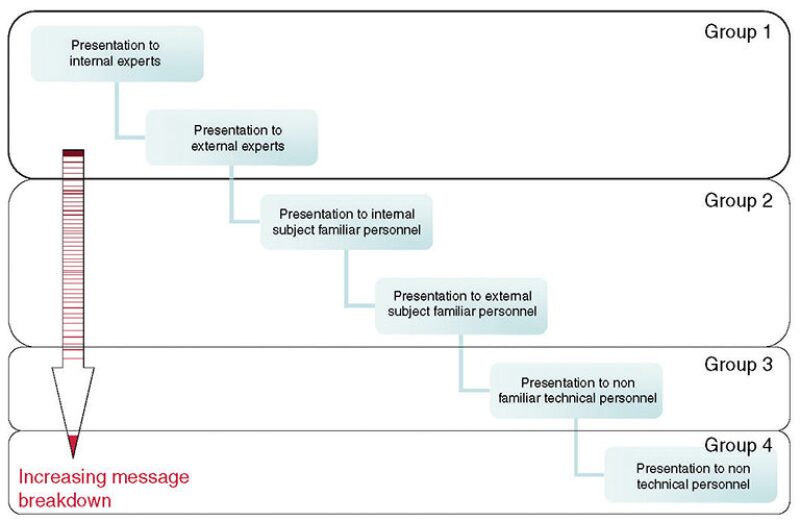
We can use this chart to estimate how much we need to break down our work. If we look at the Groups in regard to presenting a paper at an SPE conference, we face a challenge because Groups 1 through 3 can all be present. I would say, though, that you should aim to break down the work to be somewhere around Group 2. The reason for this is that you do not want to oversimplify for a Group that may be attending out of general interest (i.e., Group 3), as opposed to those who attended with specific focus. Workshops are much more focused than the large conferences, and so here you should aim at between Groups 1 and 2.
In terms of desired result, you must think about why you are presenting to a particular group, why they should be interested in the work, and what they need to gain for them to see the work as a success. For example, the desired result for a peer assist presentation is probably far different from the desired result for a management presentation.
The Presentation
Once you have worked out how much the message needs to be bro- ken down, you need to start preparing the slides. This is a challenge. First, at SPE workshops and conferences, you are allocated 20 minutes to present, with some time after for questions. Therefore, you need to work out how to break down the message sufficiently, yet produce uncluttered, easy to understand slides. The number of slides varies, and the guides point toward having ideally between 1 slide every 3 minutes and a maximum of 1 slide every minute. This then means you will have only around 15–20 slides, not including the title and questions slide. So how do we maximize the slides we have? In the following section, I will describe both the rules SPE has governing presentations and also some hints and tips to hopefully help you prepare a great presentation. To accompany this article, a presentation has been prepared to demonstrate these points, and I shall refer to it in this section. The presentation has been placed on the Young E&P Professionals professional network website, which can be found by logging on to communities.spe.org.
The Venue
The venue has a large impact on your presentation. Room sizes can vary from 30 seats to 1,000 seats, and the rooms could be either dark or light. For this reason, it is worth evaluating your slides before you travel to the conference or workshop for different situations. You may find that for some slides you need to prepare two versions—one for one condition (say, a light room) and one for the alternate situation. When you actually arrive at the facility holding the meeting, you can evaluate the actual room and adjust your presentation as necessary. You will have time to do this and access to computing facilities at the conference/workshop in the author room. You should, though, be prepared to drop slides that do not work, if needed.
Paper vs. Presentation
One of the most fundamental points about a presentation is that it is a verbal presentation of your paper. You should never use the opportunity to insert additional information in the presentation; you should, however, use the opportunity to clarify the message and answer questions that your peers may have in regard to your work. The general rules of presenting concerning structure, language, and preparation are as valid for a technical presentation as for any other presentation, if not more so. If we first look at the structure, the old adage of “tell them what you are going to tell them, tell them, and tell them what you have told them” is extremely useful. If you look at the presentation on the website, you will find the outline (tell them what you are going to tell them), the presentation (tell them), and the summary that repeats the outline (tell them what you’ve told them). This structure is designed to address the listening and learning associated with repetition and reinforcement of information.
SPE does have rules regarding the structure. Company logos may be used only on the title slide of the presentation, and trade names should not be used. The same rule applies to suppliers, service companies, and operators.
One of the important parts of the general rules is spelling and slang. We have all sat in a presentation and seen poor spelling, and it reflects badly on the presenter. You should thoroughly check the spelling, and not just using the spellchecker in the computer because, while this may find misspelled words, it will not find words that are grammatically incorrect (e.g., if you have mistakenly inserted whole instead of hole). You should also try to avoid slang. As someone who grew up in London, like any other person who grew up in a big city, I can lapse into using a lot of slang when I speak. This can also carry through to writing if you are not careful. Slang simply puts up an additional language barrier and prevents the audience from understanding your work.
Text Slides
Slides that contain general text should be kept as plain and simple as possible. You should not cram too much data onto a slide. Remember, time is against you, and the audience must be able to read through and understand the text in the time available. Animation and sounds should be avoided. These may work when you prepare the slides; however, when you are using a different machine at a conference, they may cause the machine to jam.
Data Slides
The main point of both technical papers and presentations is to present quantitative data that support your conclusions. It is normally the presentation of these data that actually causes the most problems, and the majority of the online presentation is dedicated to how and how not to present data. The central learning here is again the relevance of the data to the presentation (remember the paper contains the fine detail) and displaying the data in a way that allows the audience to interpret and understand them, all in the extremely short amount of time the data will be on the screen. There are problems in presenting data as text, tabulated values, and graphics. The problems center on the conjoined problems of presenting enough data to support your argument while not presenting so much data that the message is lost in too much clutter.
Volume of Data
Volume clutters slides, and the problem of clutter is most easily demonstrated when using tables. On Slide 7 of the online presentation, you will find a typical example of showing too much data, and I am sure you can think of examples of presentations in which so much data is put up that you simply cannot see it, and you certainly would not have time to digest it. The presentation of a slide such as the example serves no purpose. Remember: clear and simple and relevant.
Graphics
Graphics are perhaps the best way to present data (if appropriate) during presentations, because they present the data in a very easily understandable form. However, there are many pitfalls here also. In Sides 9 through 16 of the online presentation, you will find several graphics and notes about them. You must think carefully about the amount of information a slide shows and whether you need to add further details in terms of improved legends or background details that will aid the audience. It is important to note that the level of information needed on a graph also increases when presenting to an outside audience, because their familiarity with software packages or the way you display certain forms of data may be low. For those of you in the logging industry, the attention to the graphics becomes especially difficult when trying to present logs. Logs, by their very nature, attempt to present changes in multiple parameters that are time or depth indexed. This presents problems for scale, detail, and, not least, for the header to explain the curves displayed. My personal experience from both presenting logs and watching presentations is that logs rarely display well.
Video
Video can work very well, and the use of video clips in presentations increases year after year. SPE guidelines recommend having video in AVI format if possible. You will also have opportunity to ensure that the video works at the meeting. Again, though, you need to be ready to drop the clip if you find it does not display sufficiently well in the facility you are in.
Speed
The speed at which data are presented is an important factor in the success or failure of a presentation. Remember that the audience needs time to understand data and understand its relevance to the paper and what you are saying.
Complexity
Complexity is a difficult point to discuss. As I have stated previously, you need to take a complex message and break it down so the audience understands. However, at the same time, you must not be afraid of presenting complex themes and/or data.
Unless it is vital to the presentation, and clearly there are many examples in which this is the case, you should try to avoid listing extremely complex equations. The reason for this is that if you show a fully developed complex equation, the audience will not have time to interpret the terms involved and the equation construction. However, if you do need to show an equation, you should list what the different terms represent.
Units
It is worth remembering that at workshops and conferences, the audience is made up of people from across the globe. This means that some will be familiar with American Petroleum Inst. (API) units and some with the Intl. System of Units (SI). Therefore, if displaying a single value, you should list the value in both API and SI units. However, when displaying relationships between numbers (i.e., to show an increase or on graphs), it is not necessary to show both unit sets. The use of units is important, especially for equations in which dimensionless terms may change if the equation inputs are in another unit set.
Accuracy
Remember, accuracy is vital. Ensure that the numbers in the presentation match the numbers in the paper, because often someone in the audience will have read your paper before the conference. If you are in doubt over material and cannot double-check, remove the item.
Summary
So it is that easy! Seriously, though, what is described above and is shown in the online presentation is very subjective. The most important lesson is that preparing a presentation can be as difficult as writing the paper, but as long as you think carefully about each of the slides, and do not try to cram too much in, your presentations will be a success. Good luck.
A lot more advice can be found on the Web by entering “advice to presenters” in any search engine.